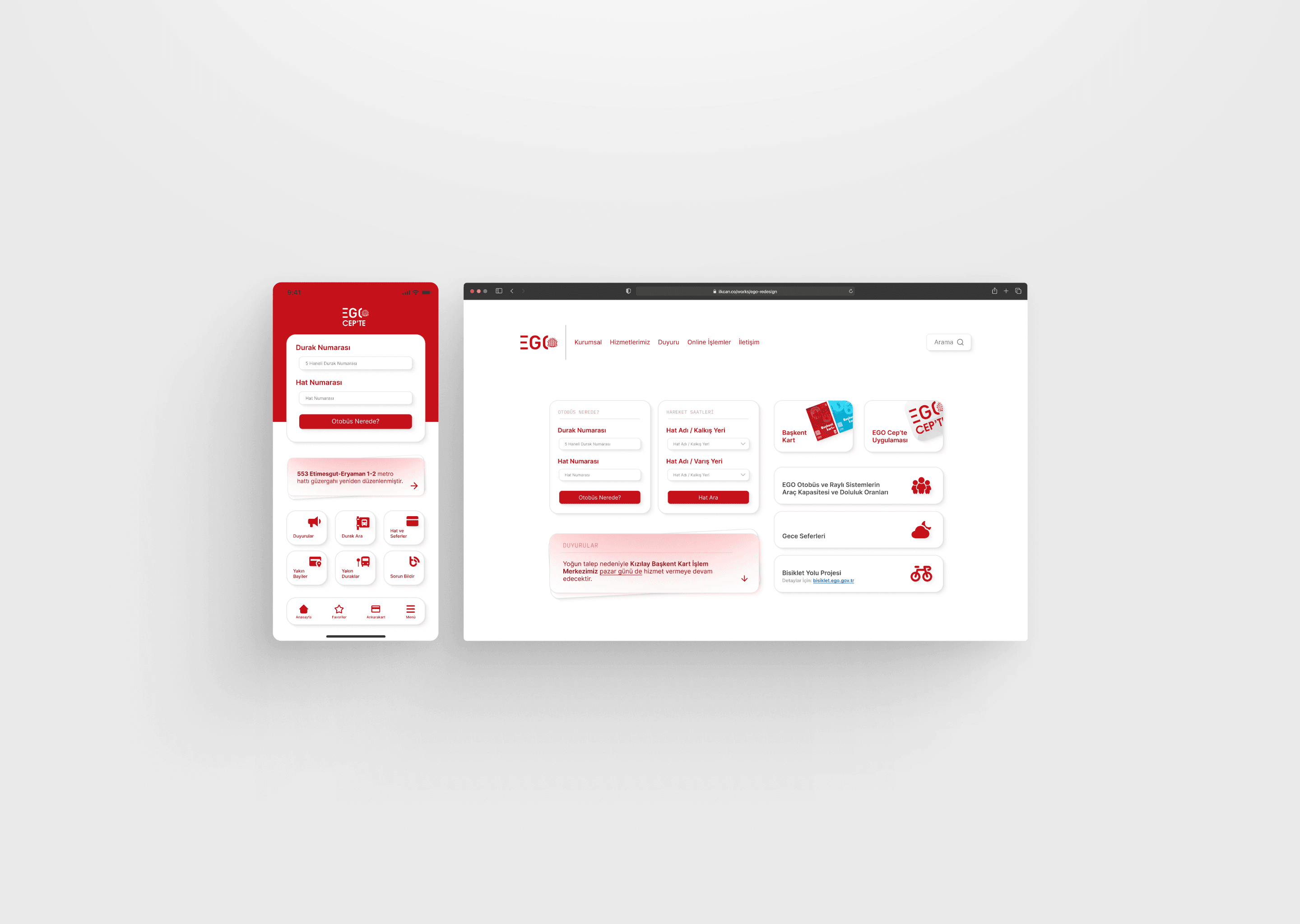
Problem
The previous Ankara EGO interface was outdated and overly complicated, making it difficult for users to navigate and access essential information. Users struggled to find transportation routes, schedules, and payment details due to the confusing and cluttered design. The interface lacked both modern aesthetics and functionality, leading to a frustrating user experience.
Solution
The redesign introduced a clean and modern interface focused on improving user experience. A simplified navigation structure allows users to access transportation information quickly and efficiently. Visually, the design now feels up-to-date and clear, making the overall experience more intuitive and appealing. This transformation makes it easier for users to interact with the platform, enhancing the accessibility of public transportation services in Ankara.